Symbolism in our Logo
The Peninsula Solidarity Cohort logo draws in a variety of religious and worldly concepts to create a graphic representation of intersectional solidarity, unity with diversity, additive power, and wielding organizational power for good.
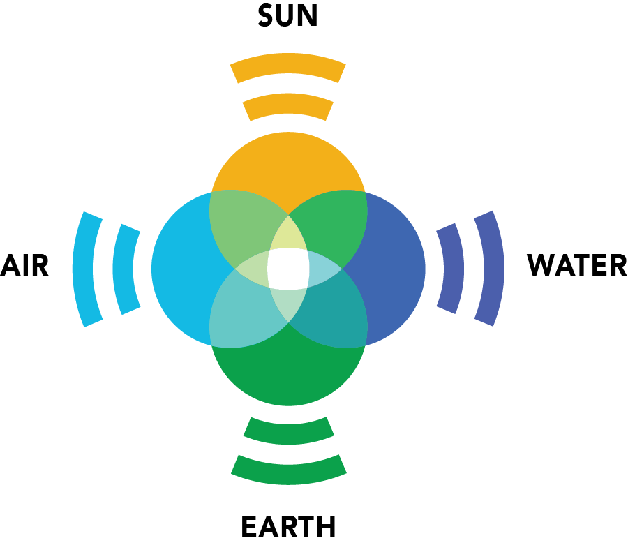
The color palette is drawn from a variety of religious traditions.
Saffron found in Hindu and Buddhist traditions
True blue found in Judiac traditions.
Green found in Islamic traditions.
Sky blue found in Christian traditions.
The position of each color reflects the elements which sustain all life.
This shape, the chair, represents having a seat at the table where decisions are made.


This shape, the megaphone, represents having a voice in the community.
Together, the two shapes represent bringing people together to create solidarity and speak with a common voice.


The shape formed by overlapping circles, the compass, represents the mission of being a moral compass for San Mateo County.
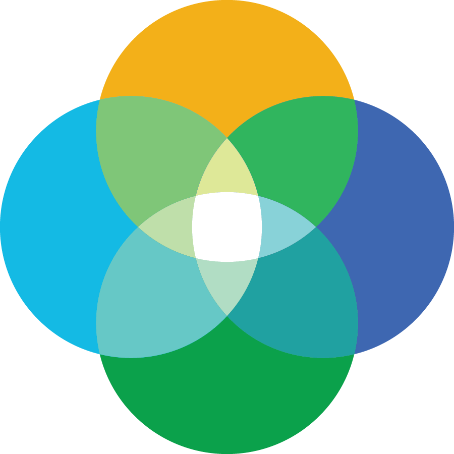
As the colors overlap, they grow brighter. This additive color mixing represents the greater power that arises from working in solidarity.
Together, these elements form the image we use as a symbol of our mission and strength in diversity.
